Here are some samples, but the font choices are not limited to these obviously:
1.
 2.
2.
3.

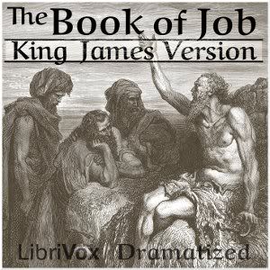
(The background image is from http://catholic-resources.org/Art/Dore.htm)
2.Number two is also my choice and I can't think of another font that would be better.Hokuspokus wrote:I like 2. the best. It looks like written with some old writing instrument.
I agree with two lines:Hokuspokus wrote:Some other things I would do different:
make it King James Bible instead of KJV
use the same font for King James and The Book of Job
give it just a little sepia
choose a bigger part of the picture
give it a little white rim
use a semi-transparent white layer, when writing over dark parts of the picture
 5.
5.