Page 1 of 1
LibriVox logo and fonts
Posted: August 20th, 2018, 12:32 pm
by klarawindei
I searched for the LibriFox logo to create a cover image and found some resources:
On the banners site, there are also specifications for colors and fonts. I'm wondering why no open fonts are used for the logo.
There are a lot of open fonts if you search for SIL
https://en.wikipedia.org/wiki/SIL_Open_Font_License.
As I am very new here, I have some questions:
- Is there a need to remake the logo with open fonts, which look nearly identical to the logo? (Is LibriVox allowed to use the current fonts, even in the next decades?)
- If the current logo should be retained and if one wants to create the logo in differen file formats, is this file the best source? https://wiki.librivox.org/images/b/bd/LibriVox-logotext.svg
- Is there a need to update the wiki pages? (Hint: the answer is yes.)
Re: LibriVox logo and fonts
Posted: August 21st, 2018, 5:22 am
by klarawindei
There are (at least) two vector graphics of the logo.
-
File: https://wiki.librivox.org/index.php?title=File:LibriVox-logotext.svg
Used at: https://wiki.librivox.org/index.php/Promotional_Material
Nodes: 127
-
File: https://ia800302.us.archive.org/16/items/librivox_cd_covers/templates/logo.svg
Used at: https://wiki.librivox.org/index.php?title=CD_Covers
Nodes: 1284
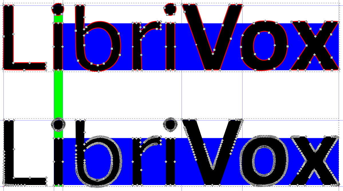
Sadly, if you scale both versions to the same width, the thickness of the characters differs (marked green).
The first version seems to be better, but a stroke is used inside the SVG XML.
Is there anybody who owns the rights of the fonts to create a high quality SVG version, which could be used as a template for eternity?
Re: LibriVox logo and fonts
Posted: August 21st, 2018, 6:48 am
by klarawindei
Finished. Here is a SVG file, which meets the dimensions of the cd-covers file and which is based on the promotional file.

Download:
https://archive.org/download/LibriVox-Logo/logotype/LibriVox-logotype.svg
Can anyone confirm the validity of the dimensions? (letter spacing, font strength)

Re: LibriVox logo and fonts
Posted: August 21st, 2018, 11:31 am
by plaidsicle
I think your new reworking looks good!
I'm not sure anyone has thought about open fonts vs. anything else.
and I'm not sure what the process for updating that sort of thing across all our miscellaneous spaces and processes would be, but maybe we could make a start?
Re: LibriVox logo and fonts
Posted: August 21st, 2018, 1:06 pm
by klarawindei
A change of the fonts is not necessary, if there is one responsible persion in the Community who acquires the fonts. Maybe that has already been done.
But I really would suggest to have exactly one vector graphics file as a source to create other derivates in the future.
Update: Some files are ready at the
wiki and the
Internet archive
Re: LibriVox logo and fonts
Posted: October 22nd, 2018, 2:17 pm
by Basquetteur
Hi,
I have only seen this thread now, so may be it is not relevant to comment now.
I think the reworking of the logo is a good idea and it is nicely done by you Klarawindei.
I think it would be also better (although not absolutely necessary) if the logo would be completely opensource, and also that it would use open fonts instead of proprietary fonts.
I do have a little bit of a question about the logo as it is now. As it uses two different fonts, this gives (to me) the impression that the first part, Libri, is in normal font while the second, Vox, is in bold.
I have now seen also the logo in square form at
https://wiki.librivox.org/index.php?title=User:Klarawindei. Is it not desirable to center the alignement the second line Vox?. It looks aligned to the left.
I also wonder if some kerning could not be done on the first line (or on the two) so the two lines would occupy the same width?.
Cheers,
Basquetteur
Re: LibriVox logo and fonts
Posted: November 8th, 2018, 7:57 am
by Basquetteur
Although I hesitate a little bit to come back to this, I would like to try to clarify what I mean about the kerning of the letters and centering and that I have used a quick and dirty version of a round logo for librivox in two of my last covers. These are these ones:

and

Also I have noted that the librivox twitter account has a nice round image:
https://twitter.com/librivox?ref_src=twsrc%5Egoogle%7Ctwcamp%5Eserp%7Ctwgr%5Eauthor
(I do not know the name for these identification images to identify accounts in twitter speak)
The image used there is this one:

Cheers!
Basquetteur
Re: LibriVox logo and fonts
Posted: November 8th, 2018, 4:19 pm
by Availle
The twitter image as such isn't round - you upload a square one and twitter displays it round all by itself.

Re: LibriVox logo and fonts
Posted: December 3rd, 2018, 4:19 pm
by klarawindei
True. Here it is:

Also I have noted that the librivox twitter account has a nice round image
The twitter logo was added by TriciaG (
https://twitter.com/librivox/status/1039665503114092544).
You'll find the images here:
https://wiki.librivox.org/index.php?title=Category:Graphics
Re: LibriVox logo and fonts
Posted: December 5th, 2018, 10:26 am
by Basquetteur
Dear Klarawindei,
Thank you for coming back following my message and for doing the centering of the two lines and the new materials for labels for CDs. I think the new images now available add a lot of new possibilitites for using in covers but also in other materials.
When fiddling around with the svgs you kindly provided, I noted that it is possible to compact a little the "Libri" part so the two lines "Libri" and "Vox" can occupy exactly the same horizontal space (and therefore the two lines would make a perfect square). That is what I meant by the "kerning" of the fonts. The font in "Libri" is significantly thinner (slimmer and simpler) than the one in "Vox" (and the svgs you posted show clearly that there are lots of empty horizonal, irregular spaces in between the characters in "Libri", notably the "b" but also the "i"s) so it is possible to slightly "compact" the character letters in "Libri" without decreasing the readability of the ensemble. And in fact, by chance, two of the characters are just the simplest and slimmest character, the small "i" (or in other words "Lvr" with the two "i"'s is not completely dissimilar in length to "Vox" with a different font). I think I could do that accomodation with your svg version. (I would use Inkscape, I am not a photoshop or illustrator user). I did the "quick and dirty" versions of what I mean in small size for the covers I pasted above, not properly with the svg file. My two covers tried to show what I mean, albeit not very clearly as it is too small in these covers: the current LibriVox logo can be developed also as an elegant and simple perfect square (and a circle) as a complement to the existing standard horizontal rectangular LibriVox logo.
What do you think of the possibility of compacting the "Libri" line to make it exactly equal to the "Vox" line?
Would you like me to make a try to show what I mean in detail, in svg format?
Regards,
Basquetteur
Re: LibriVox logo and fonts
Posted: December 5th, 2018, 10:42 am
by klarawindei
Dear Basquetteur,
in terms of symmetry, you are completely right.
I wanted to keep as much as possible properties of the original logo.
In the current version (image above) (1) the heights of the words, (2) the letter spacing, and (3) the letter width have been kept.
As I do not want to be responsible for more changes, I would prefer to not make additional changes.
Note that the versions of me are just a community contribution.
As far as I know, there is no responsible person.
So if you like to add additional version, I think you are free to do that.
Best,
Klara